-
Editorial direction and full layout design for Accent, a 13,500-circulation lifestyle magazine. Work includes seasonal covers, feature spreads, brand collaborations, and original illustrations such as the “Jewel of Rochester” logo. Every issue required balancing cultural storytelling, product features, and Mann’s brand identity within tight production timelines.
-
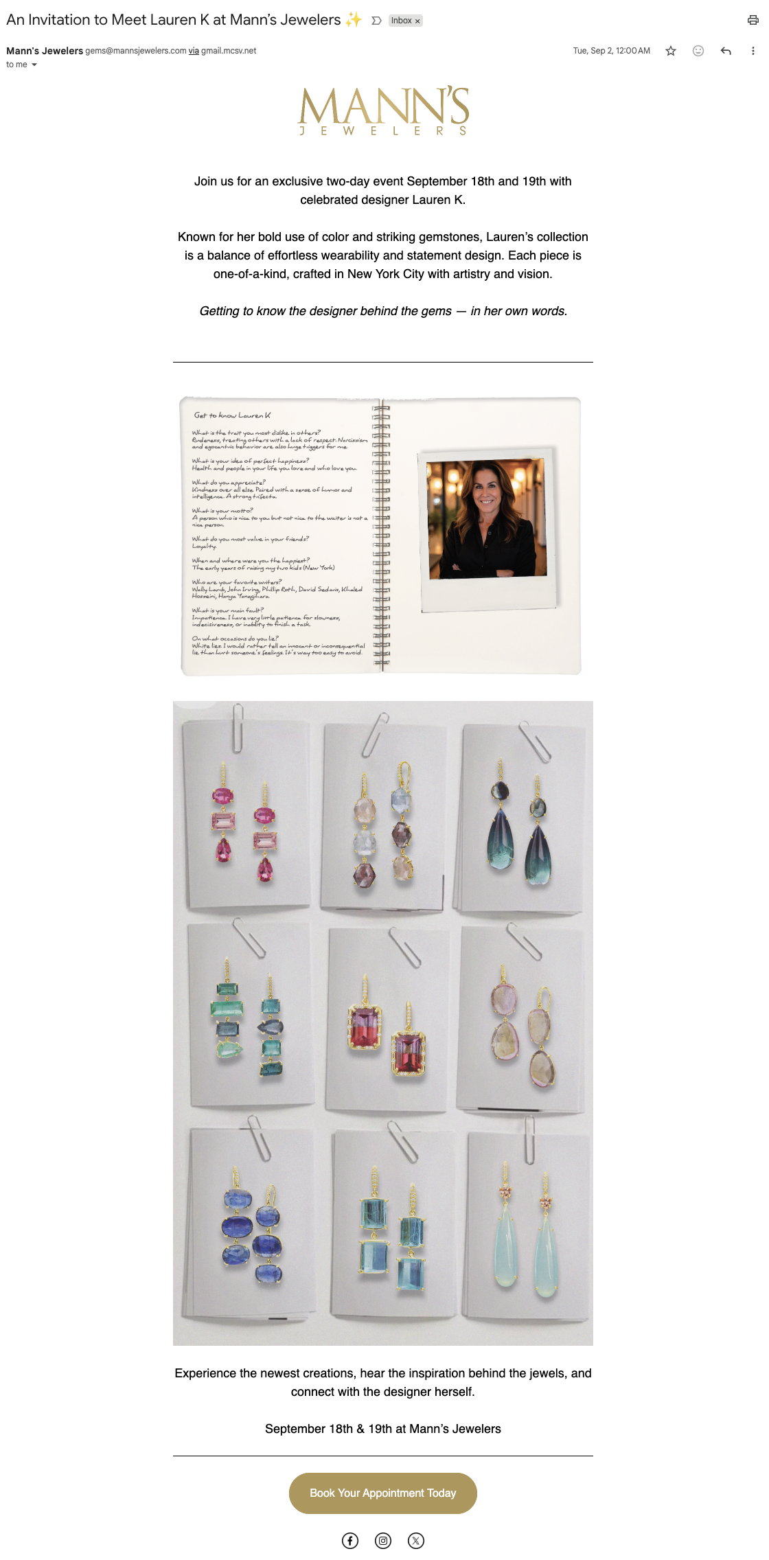
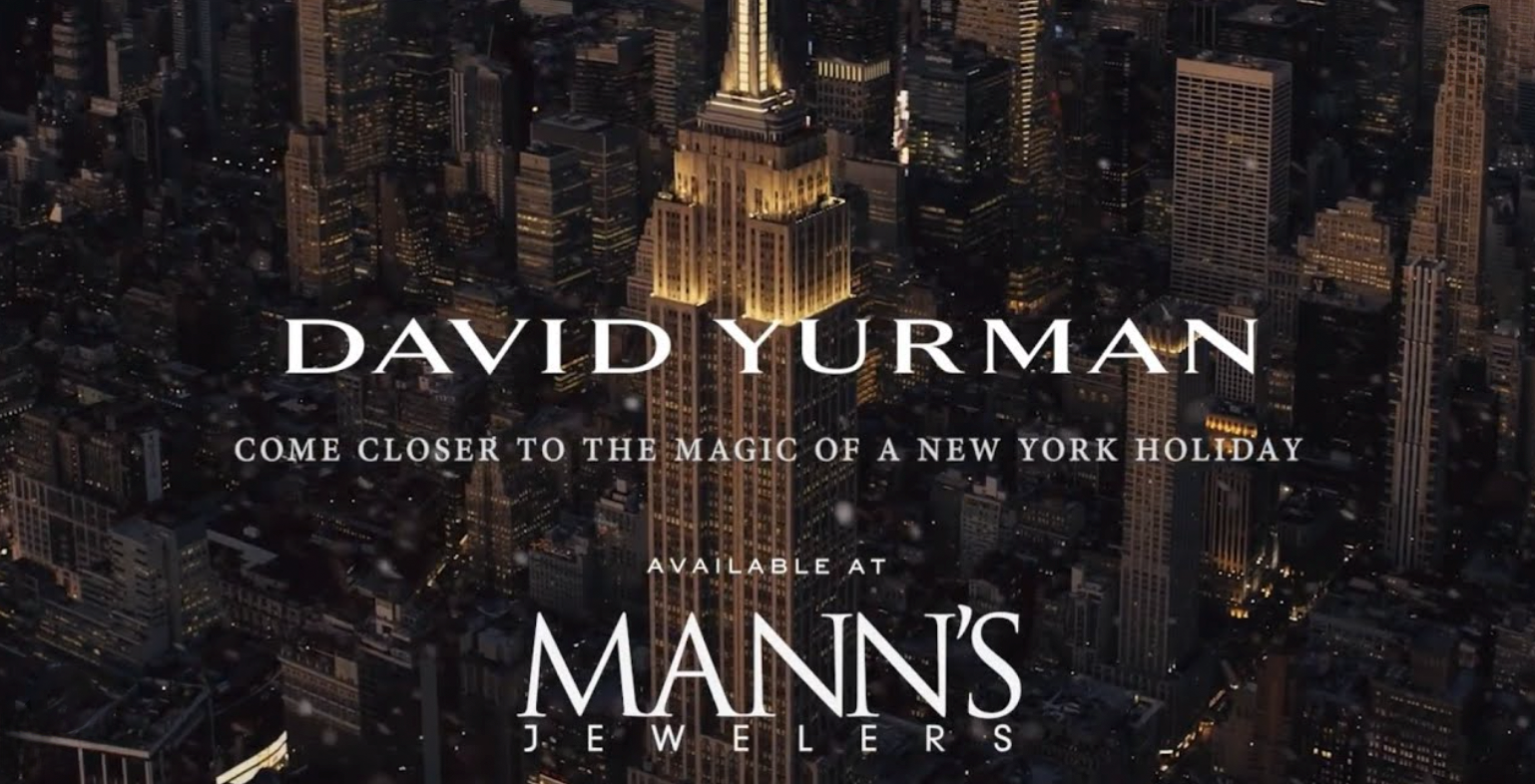
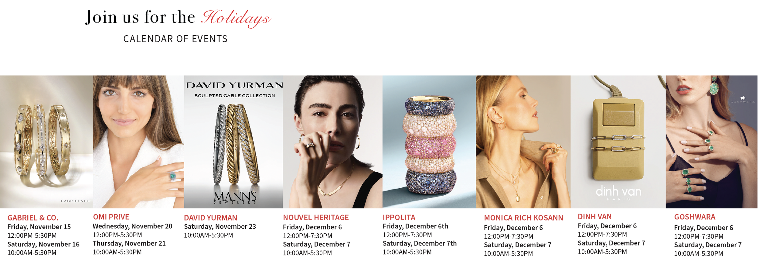
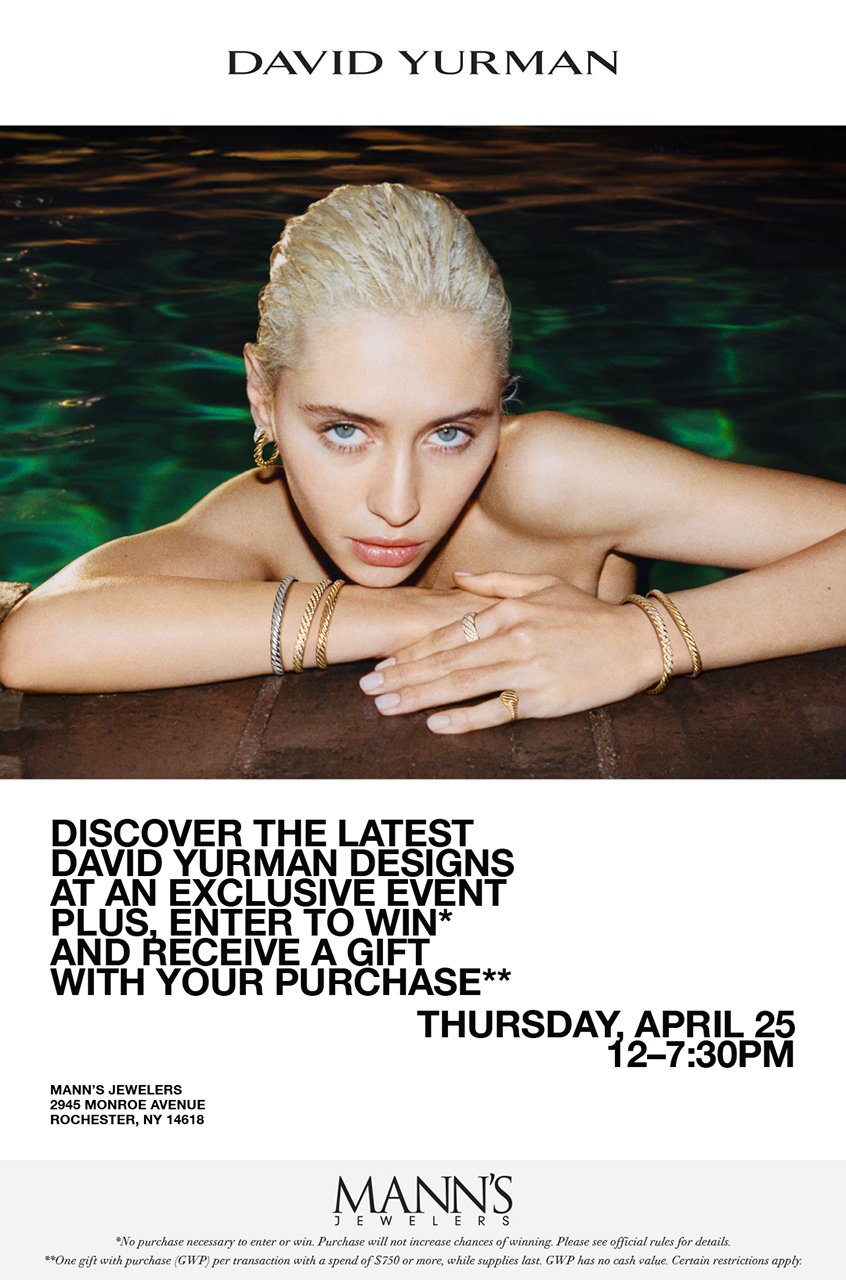
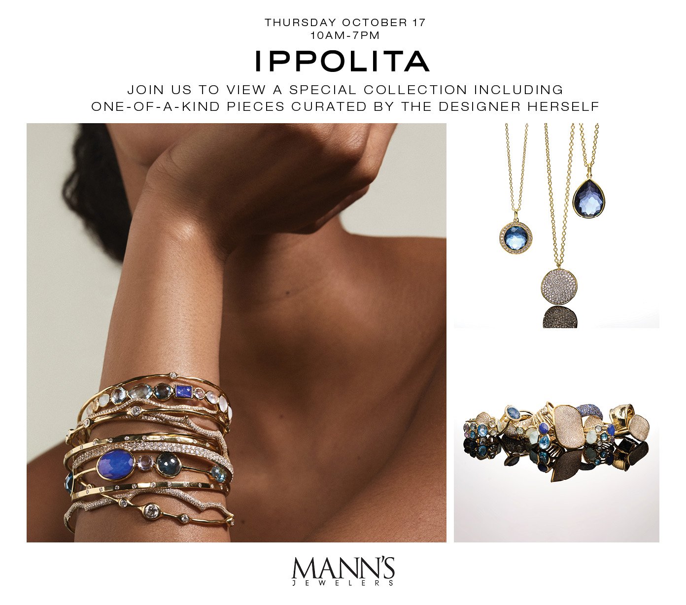
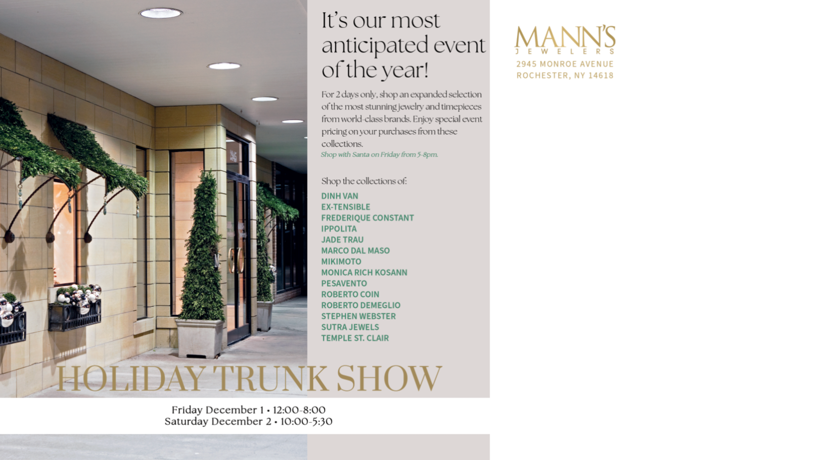
Print and digital campaigns for Mann’s Jewelers, including seasonal promotions, trunk shows, and event marketing. Work spans email, social, in-store signage, and direct mail pieces.
-
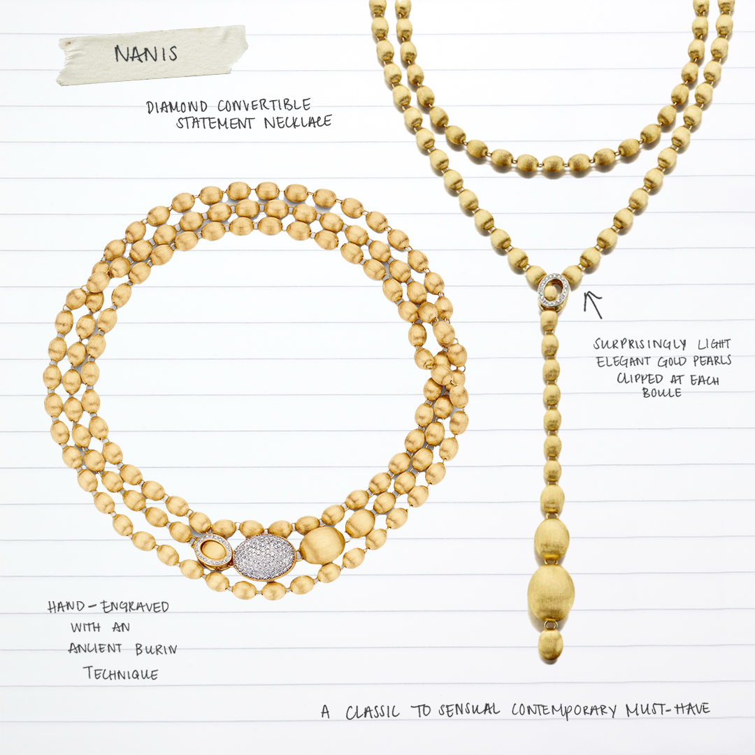
Creative direction and design for partner brands carried by Mann’s, adapting to varied guidelines while maintaining cohesion with the Mann’s aesthetic. Includes collaborations with fine jewelry houses such as Lauren K and Sorellina.
-
Editorial and visual direction for one-off initiatives — from event planning to creative concepting — where design, storytelling, and cross-functional collaboration intersect.
-
Hand-drawn and digital logos that highlight illustration, adaptability, and brand identity work. Includes original illustrated logos such as “Jewel of Rochester” for Accent magazine.
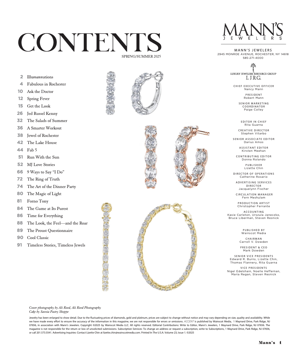
Editorial Design
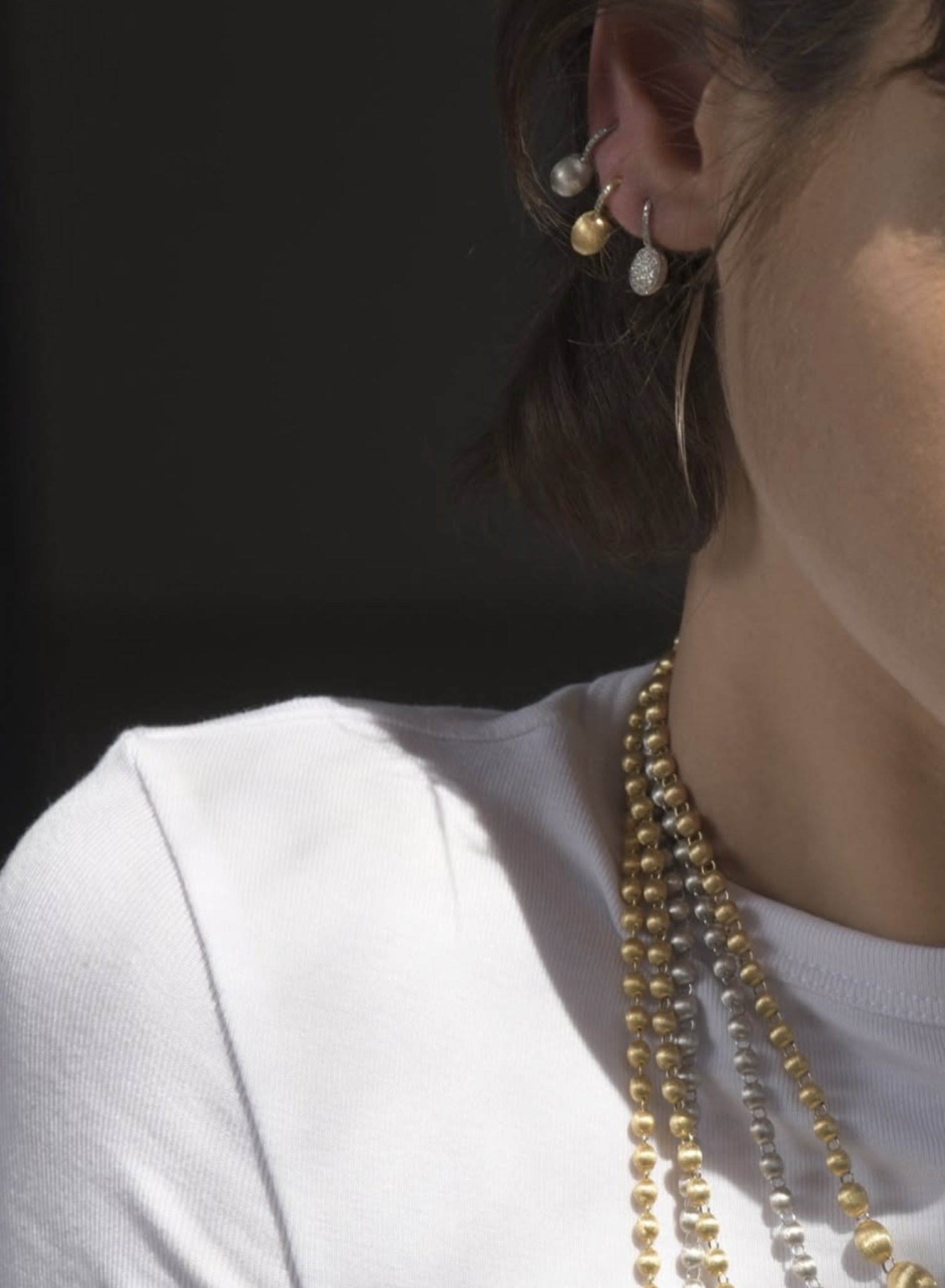
Layout design and art direction for Accent Magazine’s editorial spreads, blending textures, photography, and jewelry styling.
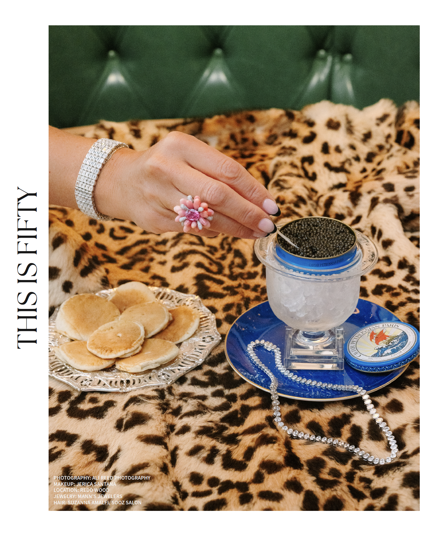
Layout design and art direction for Accent Magazine’s editorial spreads — blending rich textures, photography, and jewelry styling.

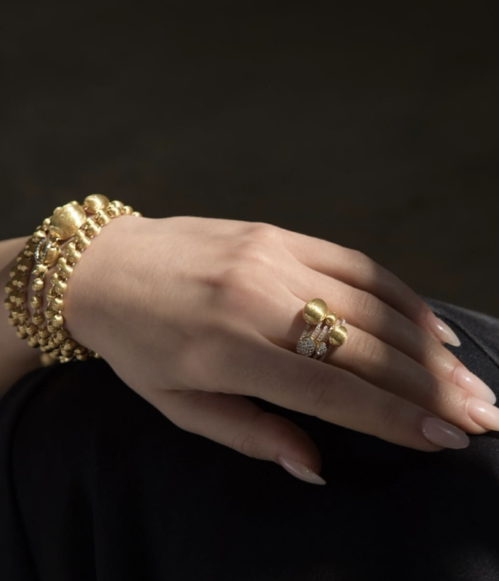
Editorial layout highlighting Brooklyn-based jewelry brand Sorellina.
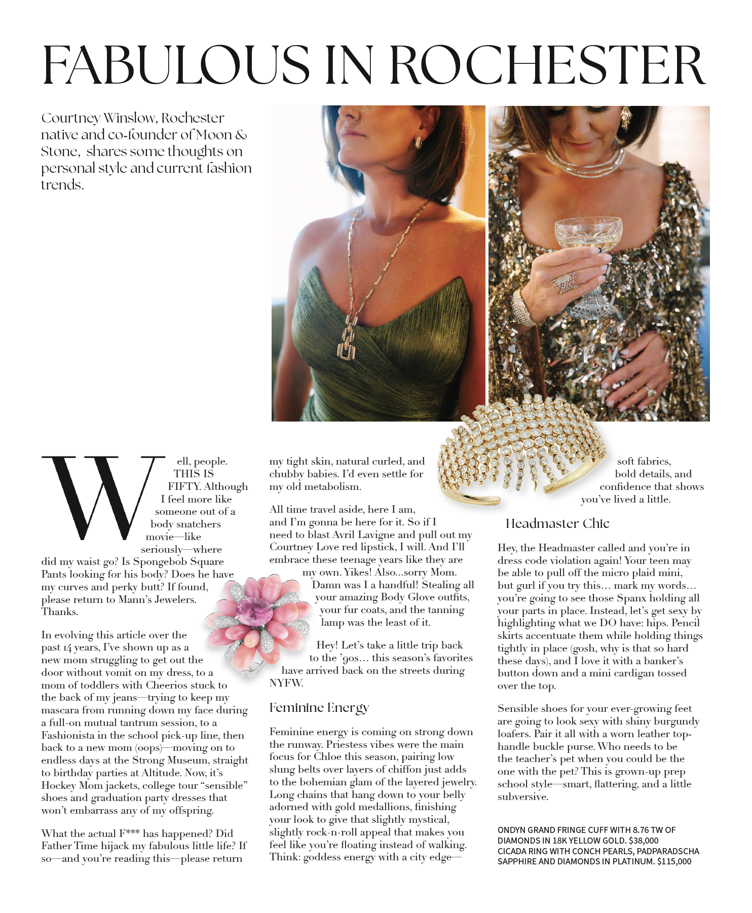
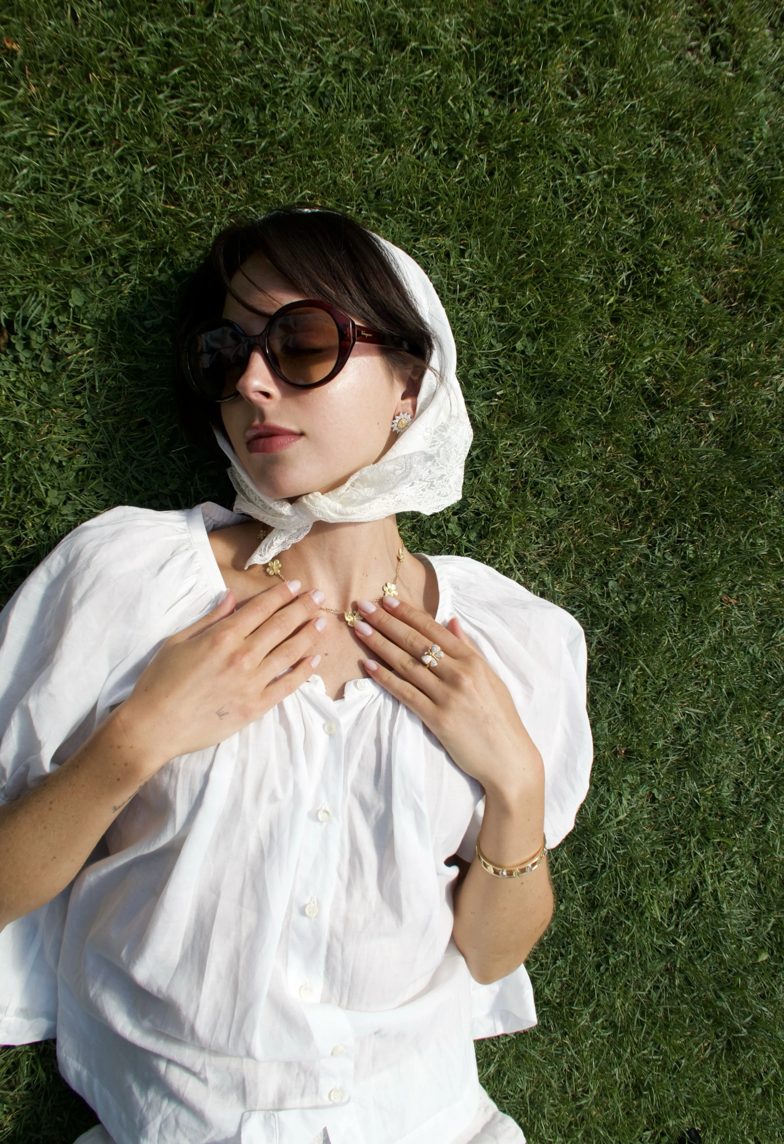
Editorial layout design and copy for Accent, spotlighting Rochester native, Courtney Winslow. Combined portraiture, product features, and bold typography to create a contemporary lifestyle spread.

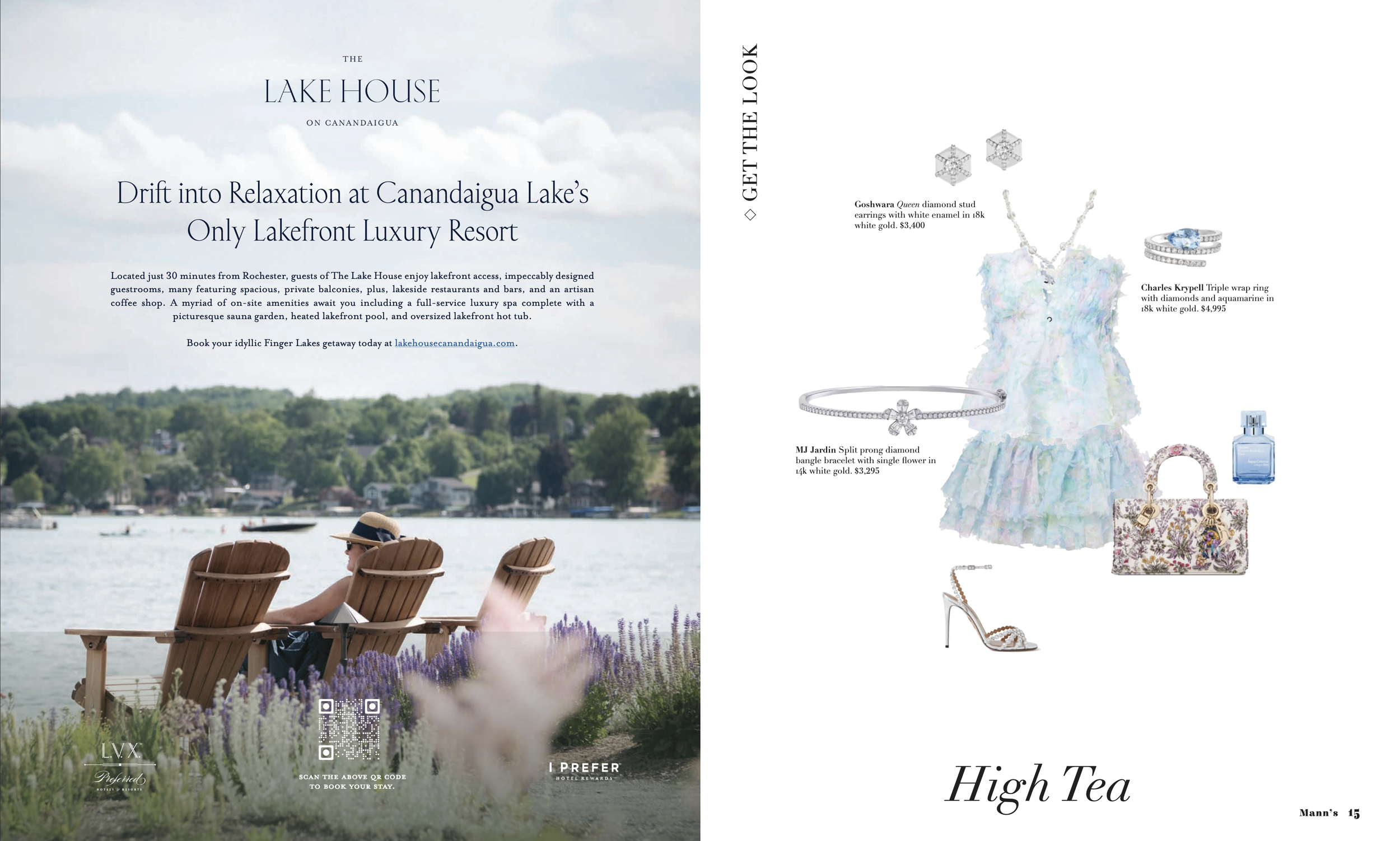
Feature layout design highlighting one of New York’s top resorts. Balanced copy with full bleed photography and a clean typographic grid to create an editorial style spread.
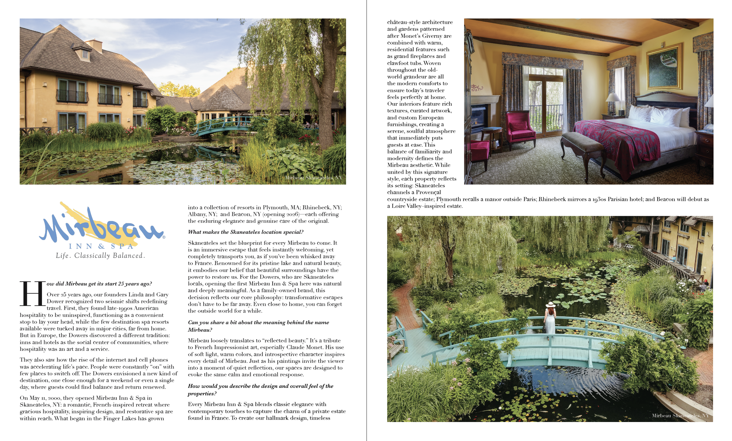
Feature layout for Accent, highlighting luxury hospitality brand Mirbeau Inn & Spa in Skaneateles, NY
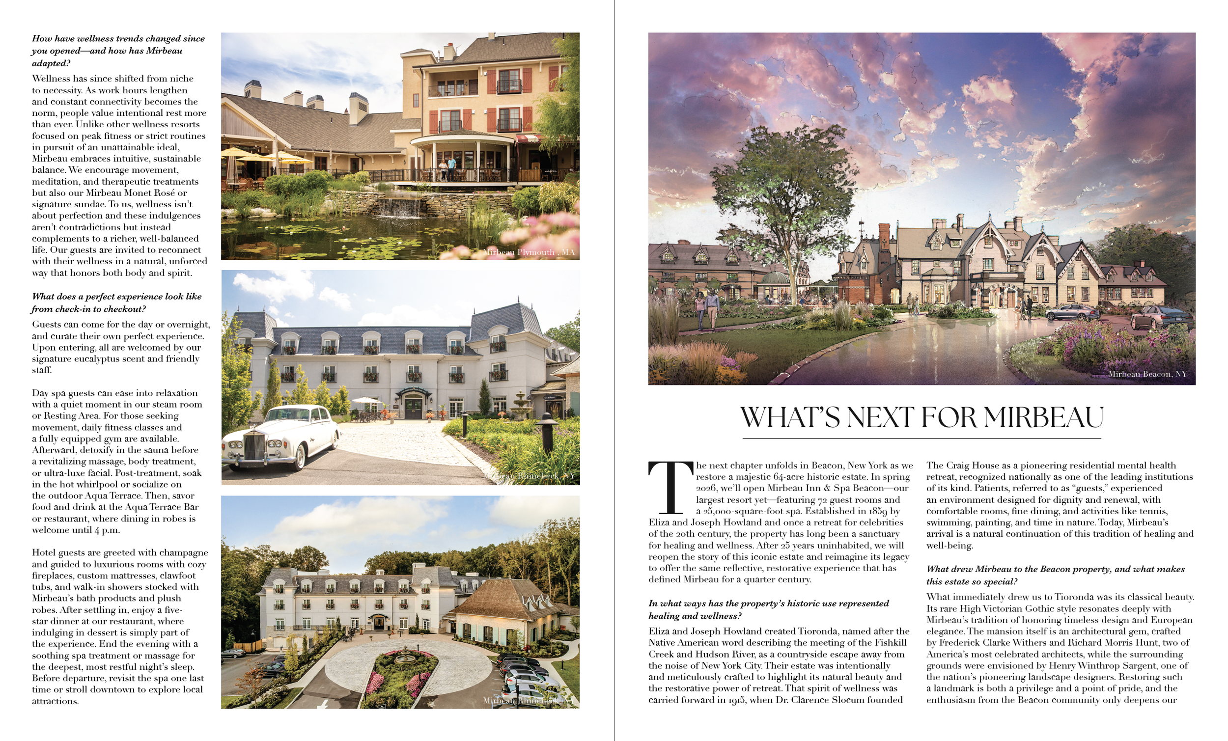
Designed to balance architectural photography and narrative.
Fall/Winter 2025 cover design for Accent, Mann’s Jewelers
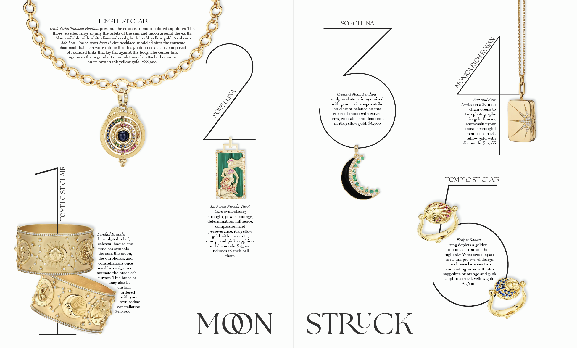
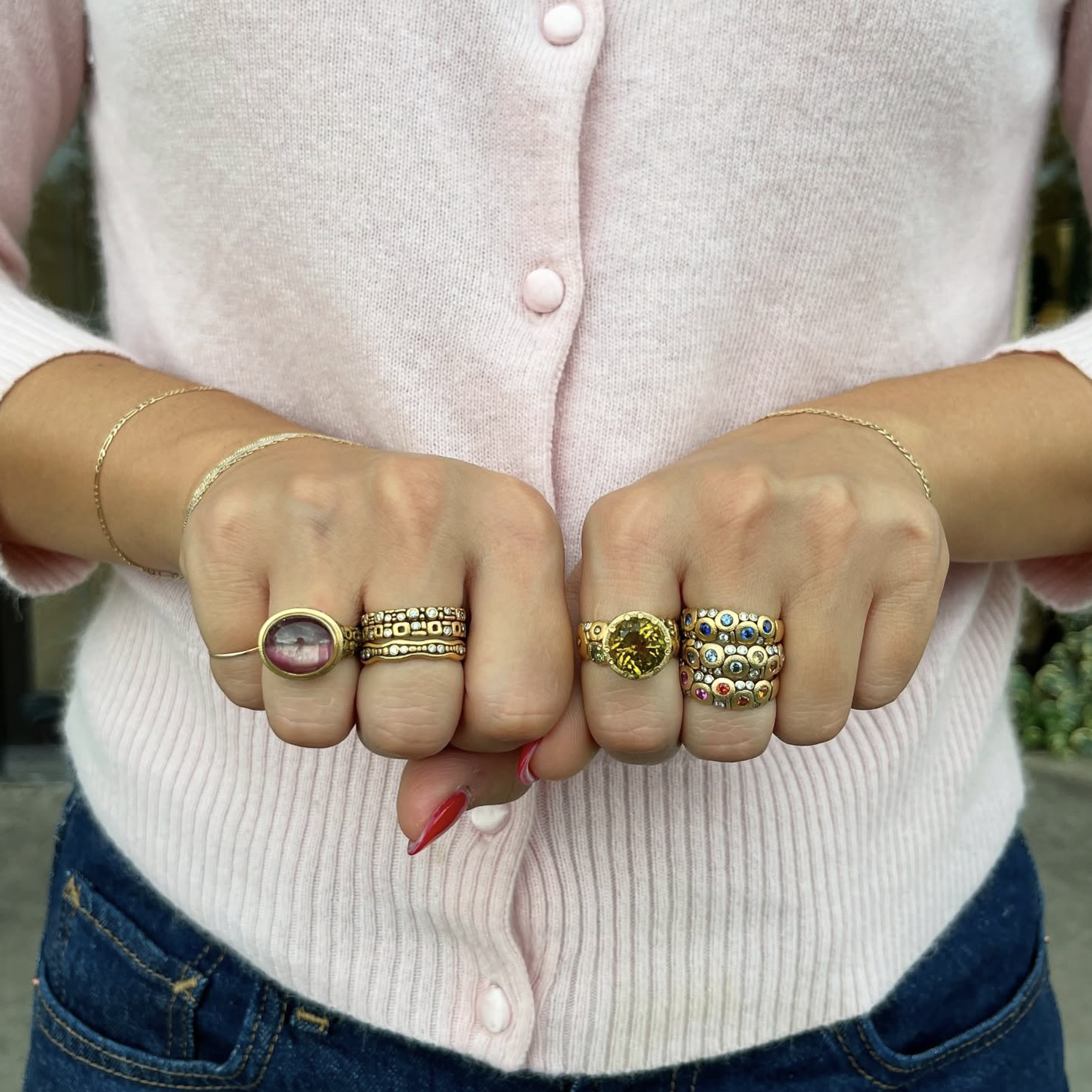
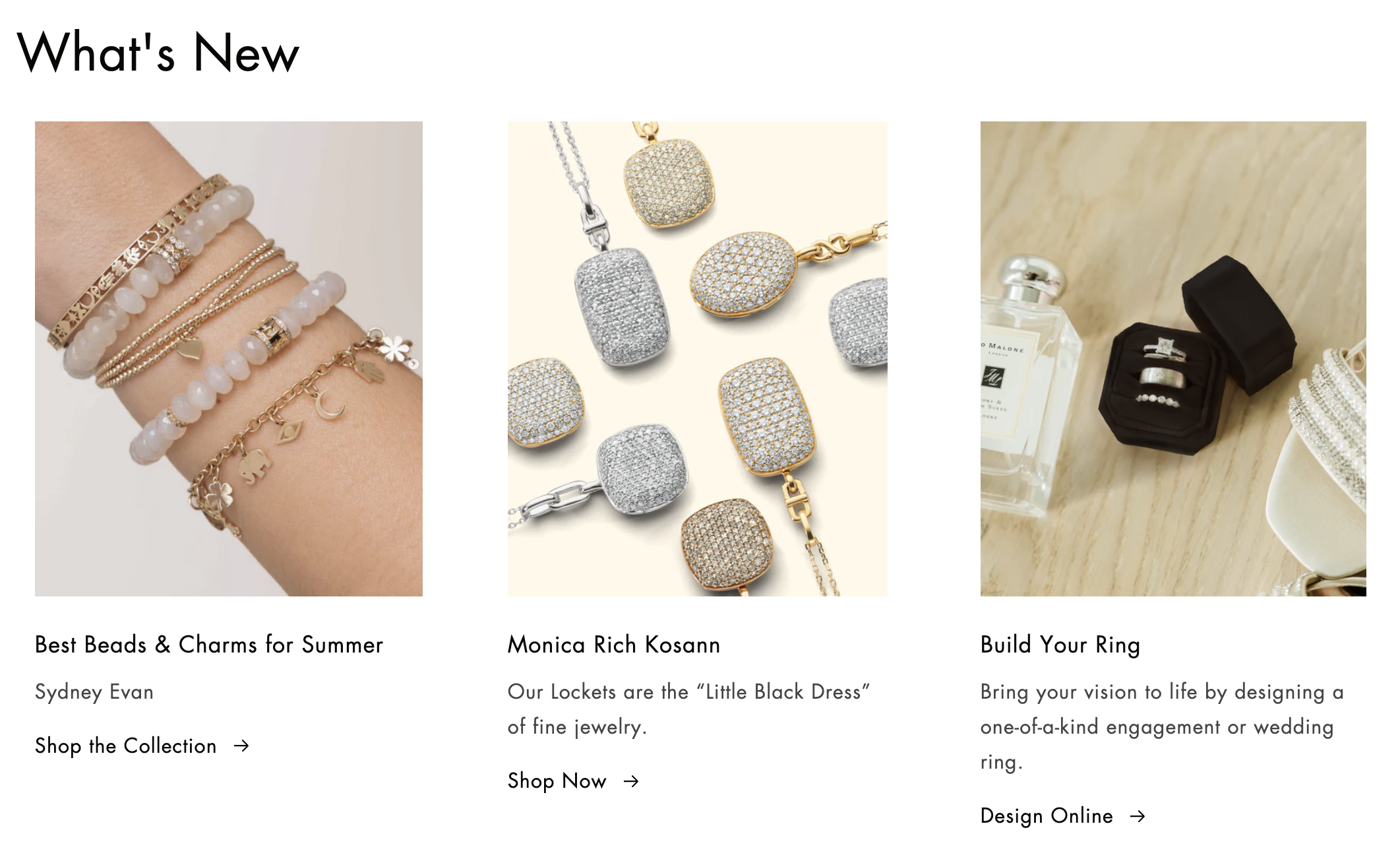
Layout design for Accent product feature. Developed a clean grid and oversized typography to showcase fine jewelry brands (Temple St Clair, Sorellina, Monica Rich Kosann) in a modern, editorial context
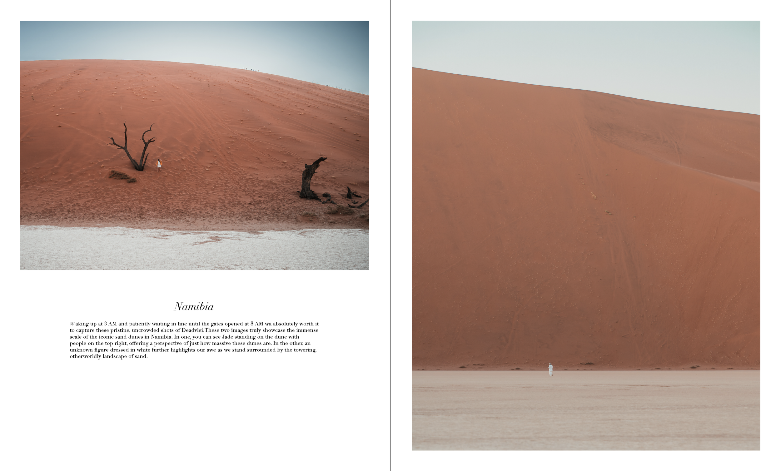
SS25 Accent Travel Feature — Namibia, Nusa Penida, Wagu Islands
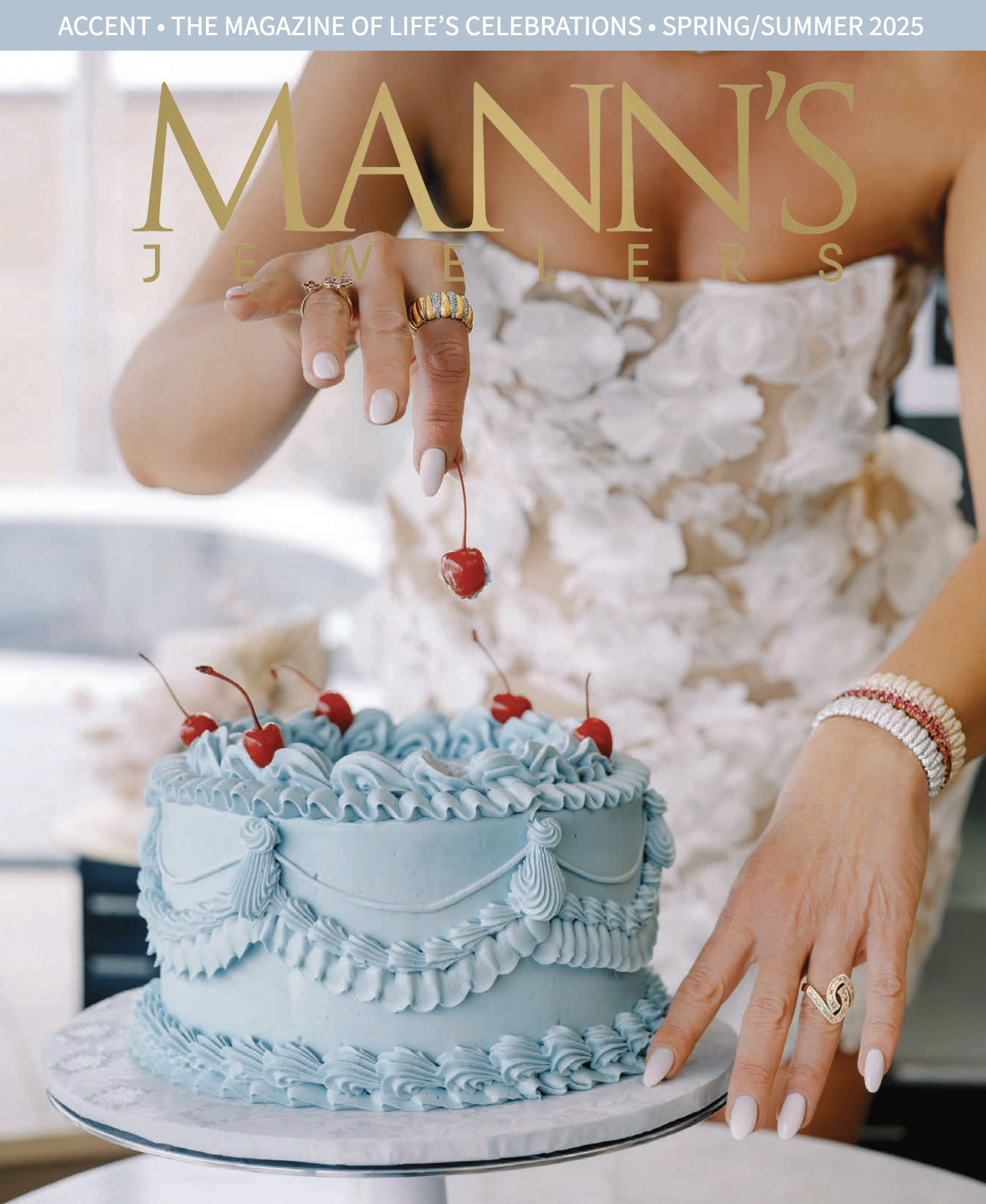
Spring/Summer 2025 cover design for Accent, Mann’s Jewelers
Email & Digital Marketing
A selection of seasonal emails, homepage banners, and digital campaigns I designed and wrote for Mann’s Jewelers.


Print, Billboard, and Direct Mail Design
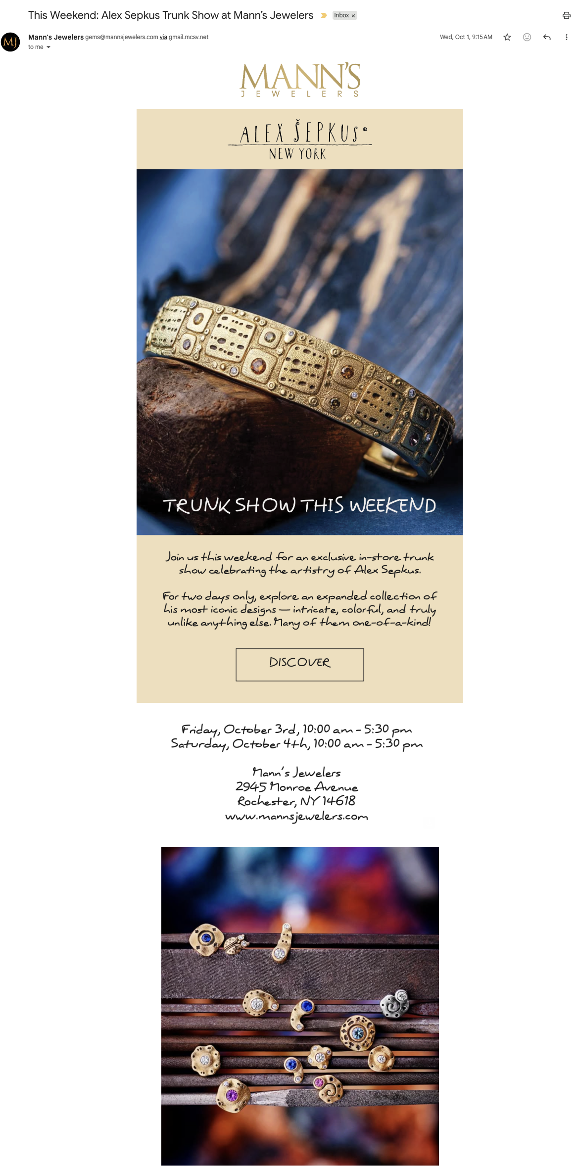
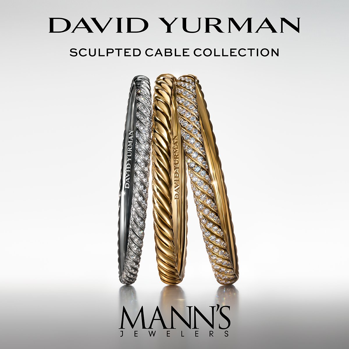
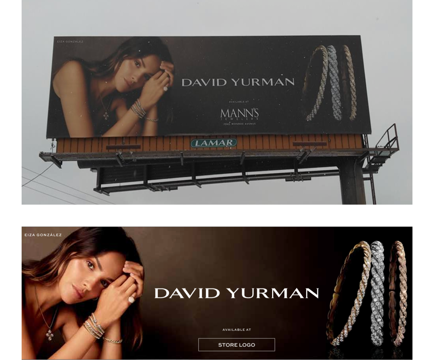
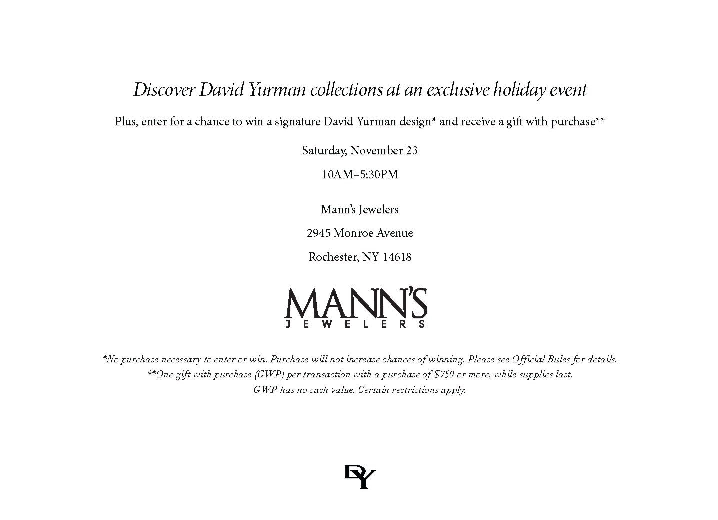
Creative direction, layout design, and copywriting for multi-channel campaigns including billboards, event invitations, trunk show mailers, and seasonal promotions. Featured brands include David Yurman, Ippolita, and Roberto Coin.
Organic & Paid Social Media
Managed content production for paid and organic social campaigns.